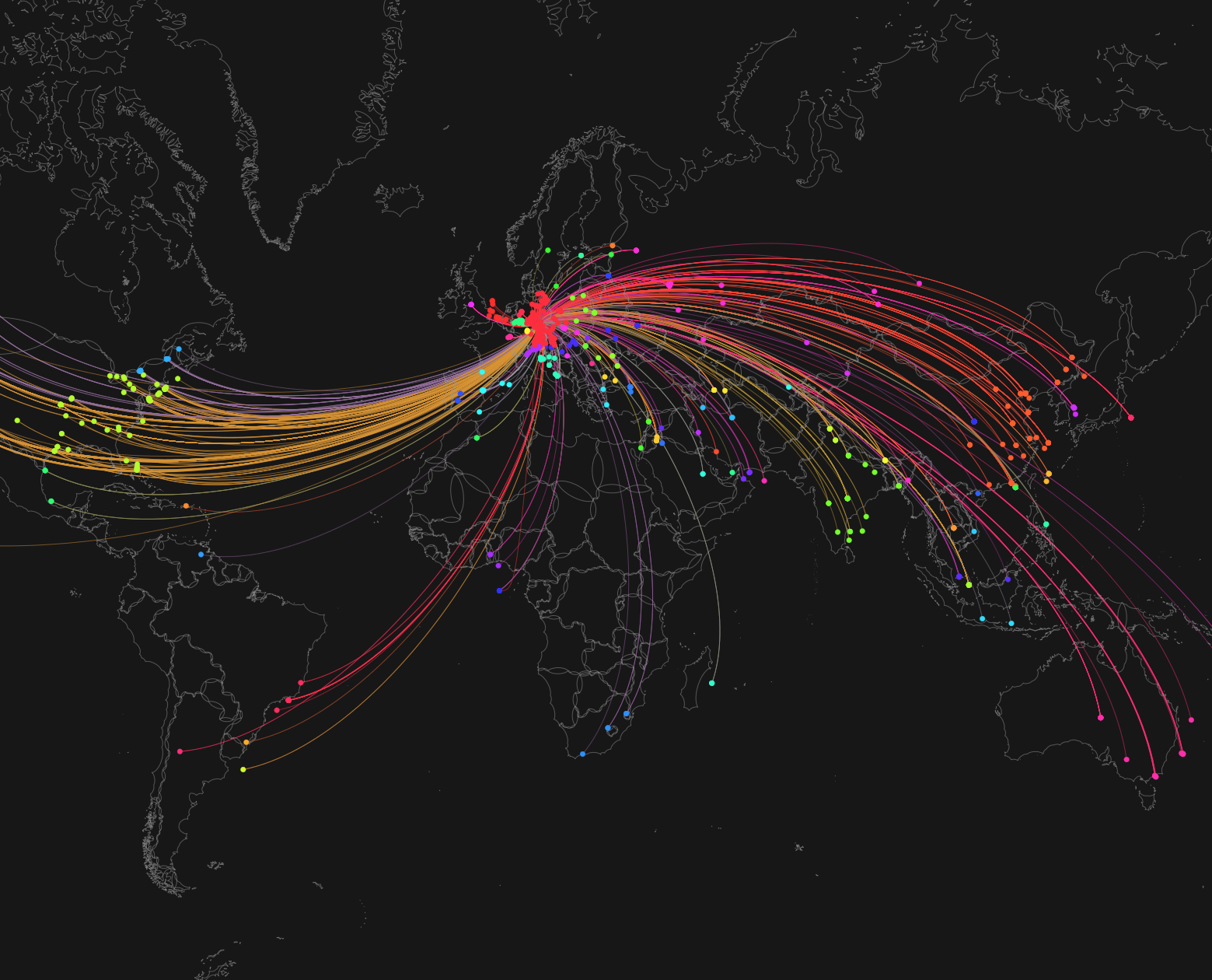
Webserver access visualization
One of my early explorations into data visualization was a tool that tracked and displayed live access requests to my web server on an interactive world map.
Every new connection was instantly drawn as a line between the server and the visitor’s location – turning abstract log data into a dynamic, visual communication network. It was fascinating to literally watch how people from all over the world interacted with my content in real time.
Beyond the fun of “seeing the internet breathe,” this project deepened my understanding of network traffic, geolocation, and visualization frameworks – skills that continue to influence how I think about data-driven insights and transparency in IT operations today.